Condominium managers and residents, connected more clearly. Identity and website for an Italian property platform that plans to enter new markets.
A shared visual language.
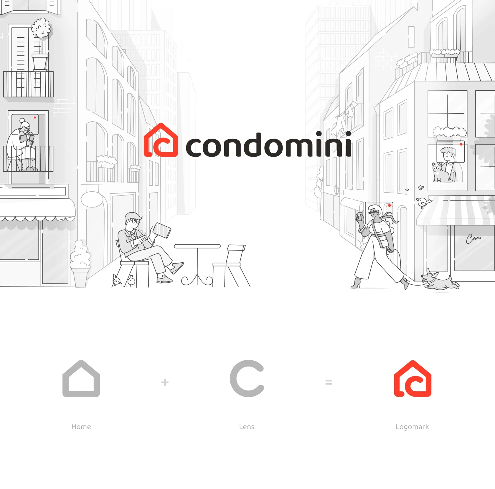
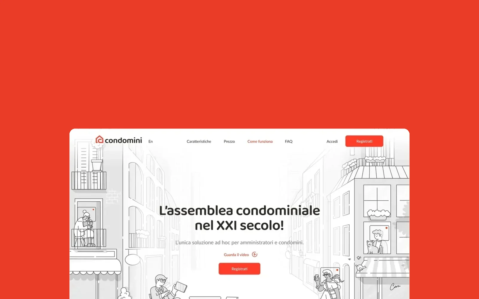
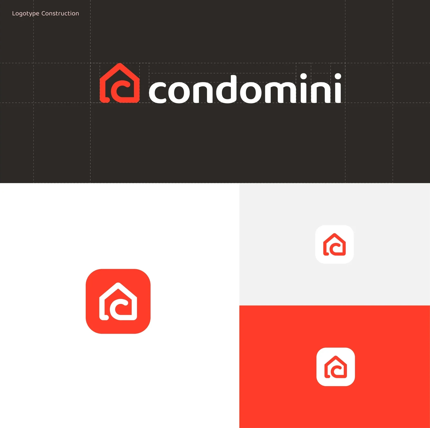
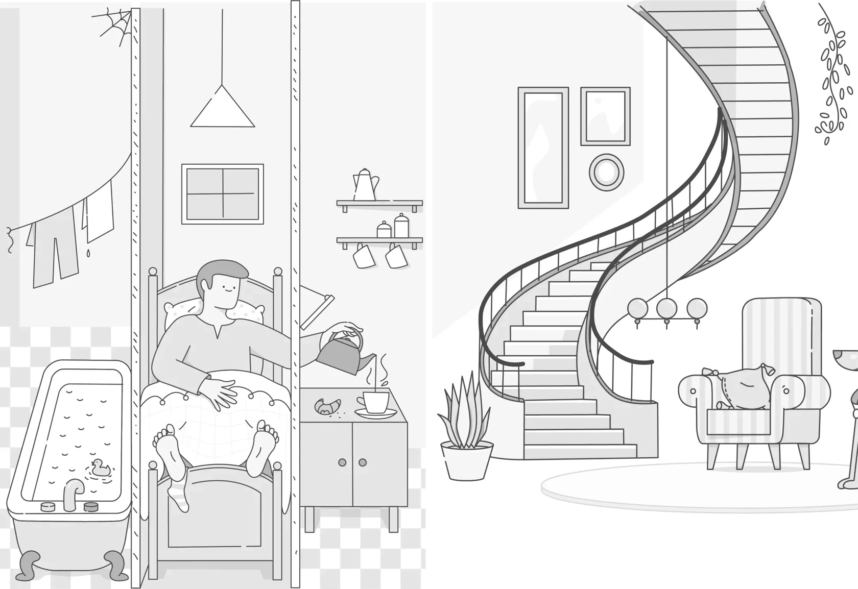
The identity connects a recognisable logomark with a world of architectural illustrations. The system carries the same character across the website, product icon and motion.
Make the next step obvious.
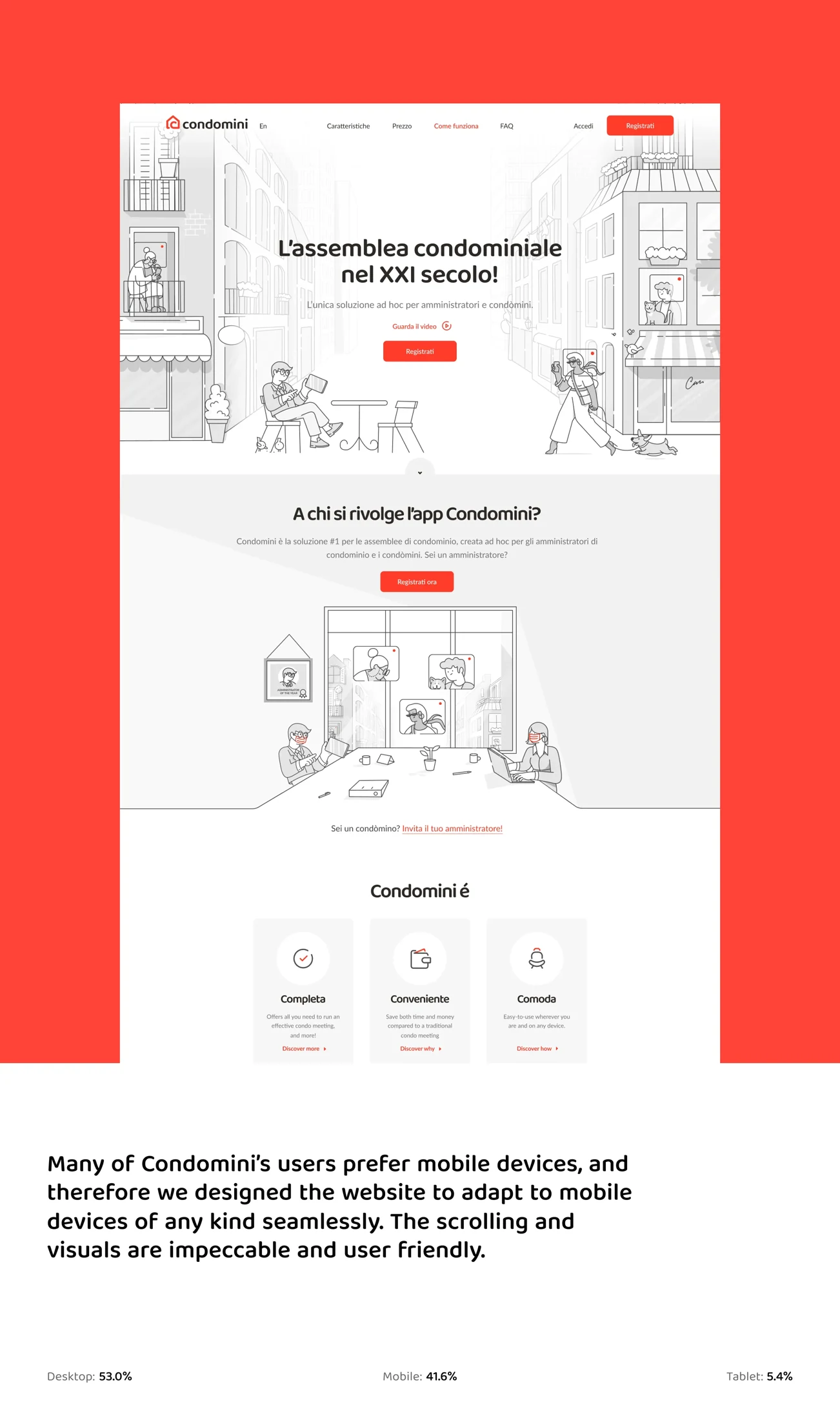
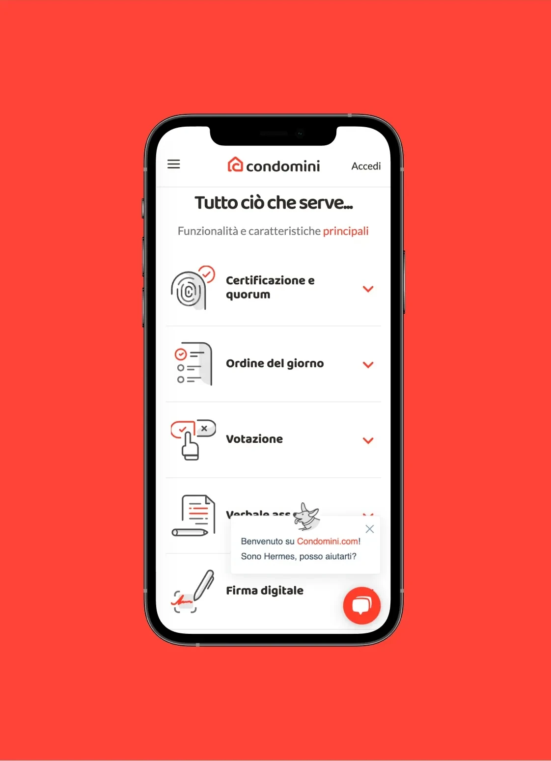
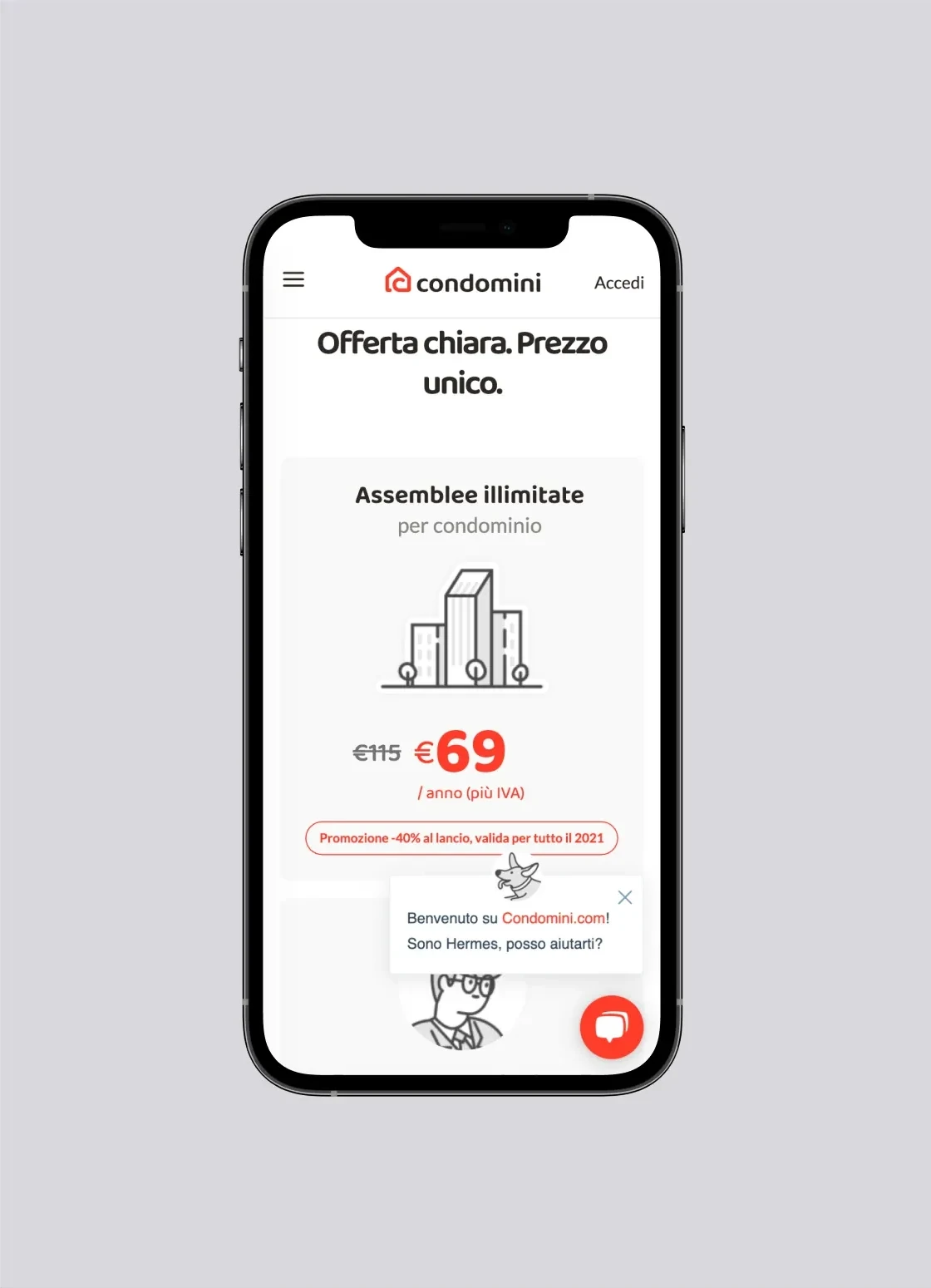
The website explains how the service works, sets out its benefits and gives each call to action a clear place. The product story moves from a familiar everyday problem to a simple next step.
Creating an assembly.
The original published interface recording shows assembly setup, participants, agenda, voting and summary.
The icon in motion.
The original published Condomini animation brings the red product icon into three dimensions.
Identity, beyond the screen.
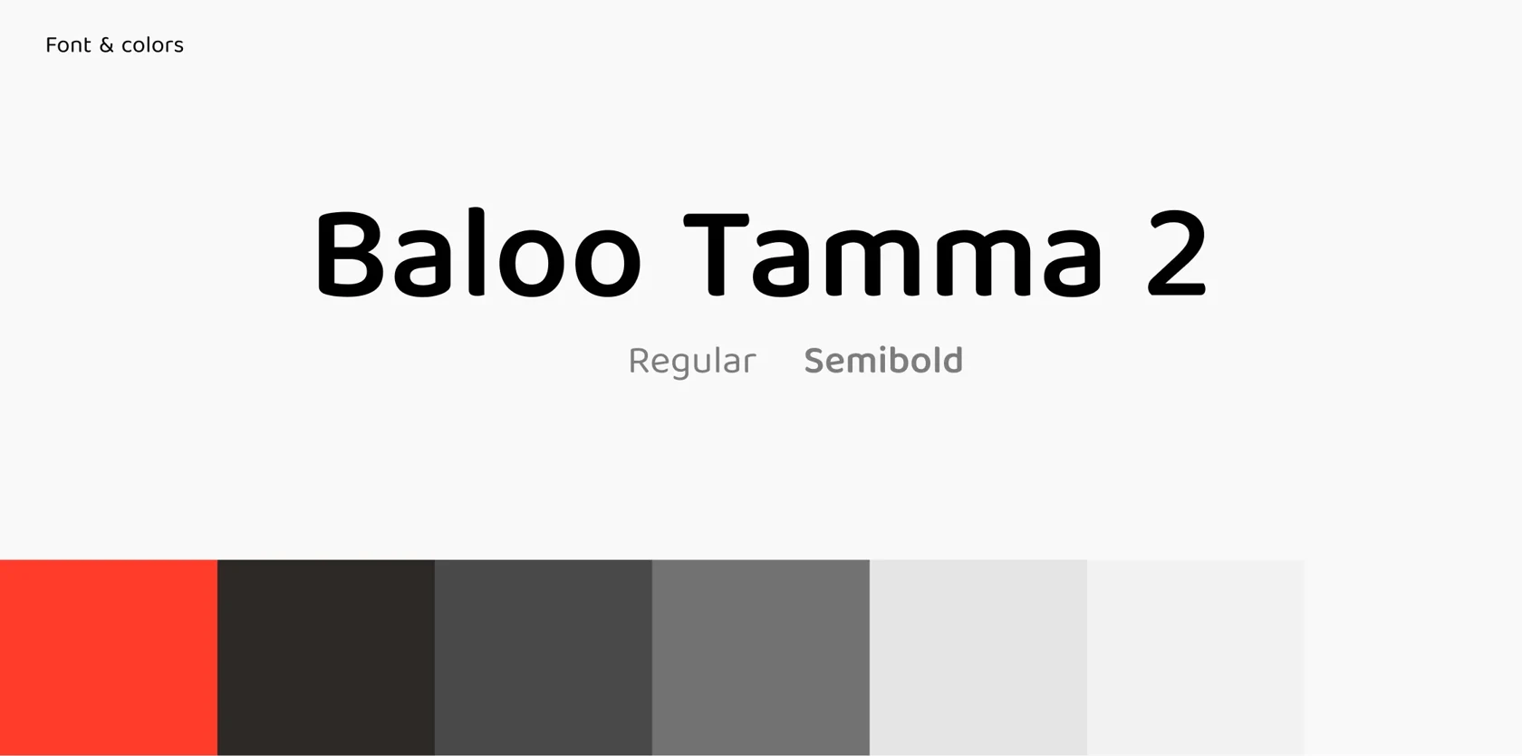
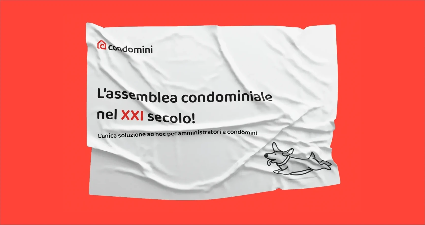
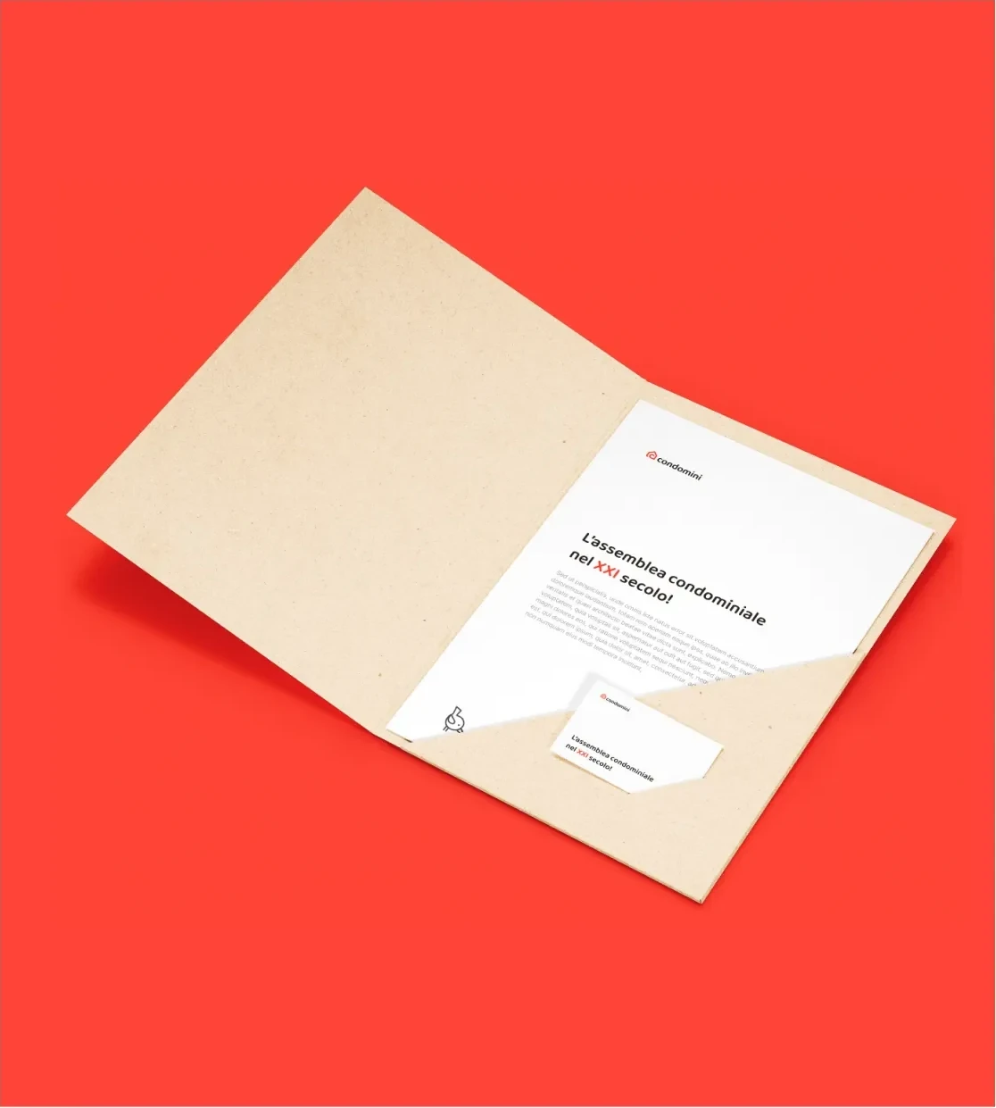
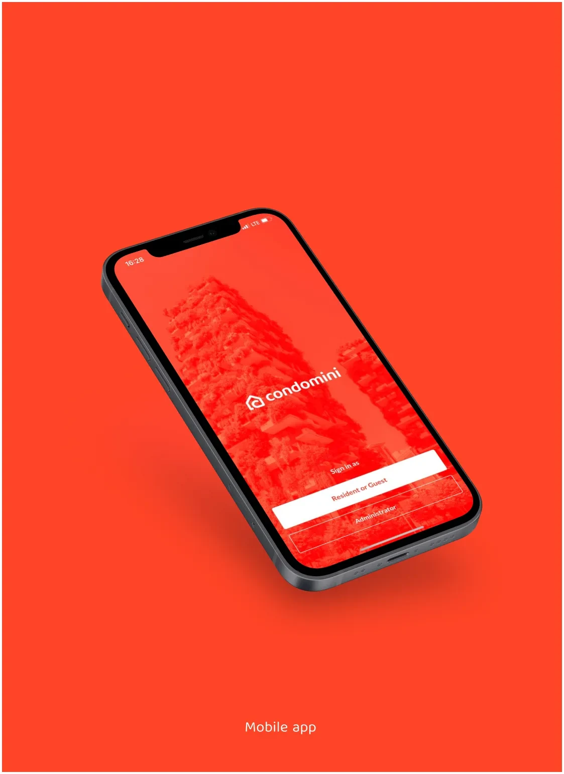
The mark, type and colour carried into campaigns, stationery, apparel and the app icon.